A tutorial on t-SNE (1)
By Guillaume Filion, filed under
series: focus on,
statistics,
data visualization,
bioinformatics.
•
•
In this tutorial, I would like to explain the basic ideas behind t-distributed Stochastic Neighbor Embedding, better known as t-SNE. There are tons of excellent material out there explaining how t-SNE works. Here, I would like to focus on why it works and what makes t-SNE special among data visualization techniques.
If you are not comfortable with formulas, you should still be able to understand this post, which is intended to be a gentle introduction to t-SNE. The next post will peek under the hood and delve into the mathematics and the technical detail.
Dimensionality reduction
One thing we all agree on is that we each have a unique personality. And yet it seems that five character traits are sufficient to sketch the psychological portrait of almost everyone. Surely, such portraits are incomplete, but they capture the most important features to describe someone.
The so-called five factor model is a prime example of dimensionality reduction. It represents diverse and complex data with a handful of numbers. The reduced personality model can be used to compare different individuals, give a quick description of someone, find compatible personalities, predict possible behaviors etc. In many applications of the five factor model, the small sacrifice in information is worth the gain in simplicity, because the reduced data has most properties of the full data.
All the dimensionality reduction techniques (t-SNE included) are based on the same principle: they attempt to preserve some relationships between the points while reducing the number of variables. In each technique, “preserve” and “relationship” have a precise mathematical meaning that we need not concern ourselves with for now. The number of data points is the same after the transformation, but they are described by fewer features so they are in a different space. There are infinitely many reduced spaces, but choosing a relationship and a criterion allows us to compare candidates and to select the best.
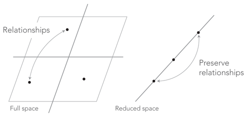
The relationships of interest cannot always be preserved. For instance, in the figure above, we could be interested in preserving the distances between the points. It is possible to have three points at equal distance of each other on a 2D plane, but this is impossible on a straight line. The distances between the points would be distorted and we would have to accommodate imperfect solutions. But there would still be an optimum for the chosen criterion.
Interpreting projections
Since all the dimensionality reduction techniques are based on the same principle, they can also be interpreted in much the same way. The following blueprint is the key to understanding the results of t-SNE, but also Principal Component Analysis, Factor Analysis and similar techniques. To interpret projection figures, you can ask yourself the following three questions:
- What do the points represent?
- What is the relationship that is preserved?
- What does it mean for points to be close?
The points in the toy example above could be a group of cities, and we could be interested in representing them on a single axis that aims to preserve their actual distances. In this case, points are close in the reduced space if their distance on the map is small. Or the points could be the weight and height of a group of people, and we could be interested in representing them on a single axis that preserves their difference in BMI. In this case, points are close in the reduced space if they represent people with similar BMI.
Sometimes (but not always), you can also ask yourself the following two additional questions:
- What do the axes represent?
- What does it mean for a point to be high on a given axis?
In the first example above, the axis could represent some geographical feature, if the cities are along a river or a road for instance. In this case, the cities at opposite ends of the axis would most likely lie at opposite ends of the river or the road. In the second example, the axis could represent an obesity score and people at one end would be lean and people at the other end would be obese.
Giving interpretations to the axes is very useful to construct mental representations of the data. However, axes sometimes remain abstract scores without particular meaning. This is unfortunately common with t-SNE, because the axes describe complex curved paths in the original space, as we are about to find out.
The t-SNE relationship
Let us now see what t-SNE tries to achieve and why this is interesting. To highlight the specificity of t-SNE, we will compare it to Principal Component Analysis (PCA). You do not need to know how PCA work to understand this section, because it will serve only to highlight one of the main properties of t-SNE.
As explained above, the defining feature of dimensionality reductions techniques is the relationship they attempts to preserve. In the case of t-SNE, it is neighborhood. Note that this is not the same as distance. Two points that are far from each other may still be closest neighbors. Reciprocally, two points that are close to each other may each be closer to many other points that would be their legitimate neighbors.
A comparison with PCA will best illustrate the meaning of “neighborhood” in this context. The relationship that PCA attempts to preserve is the scalar product between points (by the way, this is a poorly-known fact about PCA, so this may come as a surprise if you already knew this technique). If you are not familiar with the scalar product, think of points as vectors, or arrows from the origin, and think that their scalar product is high when the arrows are long and the angle between them is small. With this criterion, two points that are far from the origin and in the same approximate direction should also be far from the origin and in the same direction in the reduced space.
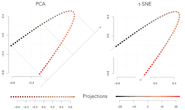
The figure above shows the projections of the same points using PCA or t-SNE. The points are originally on a plane (2D) and they are projected on a line (1D). With PCA, the reduced space is a straight line at 45° from horizontal (note that by symmetry of the original figure, each point on the axis corresponds to two points of the plane). It may seem odd that PCA selects this axis, because we lose the continuity in the original data. By projecting the points on the axis orthogonal to the one shown above, the black points and the red points would lie at opposite extremes, which would better represent the data.
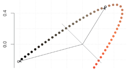
The problem of choosing this axis is illustrated in the figure above. The two points that are highlighted have a large negative scalar product, because the associated vectors are long and almost in opposite directions. After projecting them on the axis, they would both be pointing towards the upper left and their scalar product would be positive. These are only two points, but there are many more in the same case, so this projection is suboptimal.
Turning our attention to t-SNE, we see that it projects the points on the curved line going through the points. Observe that the points have the same neighbors in the original and in the reduced space, and that they are equally spaced (except at the ends, a detail that will be explained at the end of the post). The t-SNE neighborhood criterion automatically came up with this representation, which corresponds to our visual intuition of the original data (disclaimer: I had to tweak the parameters because the implementation I used is optimized for 2D projections).
It is important to understand that the reason PCA does not find this solution is not because it explores only linear transformations. Indeed, the argument above would show that the t-SNE projection has a poor PCA score because many scalar products change sign. The upshot is that the choice of the relationship that is preserved is not innocent. It is by far the most influential factor on the outcome of dimensionality reduction, so one should pay close attention to it and try to understand the implication.
Going back to our interpretation blueprint, two points that are close in the t-SNE space are likely to be neighbors in the original space, but the reverse is not true. Two points that are far away in t-SNE space tend to be separated by a large amount of points, but they can still be relatively close to each other. We also see that it is difficult to interpret the t-SNE axis in terms of the original variables because it is not monotonic. For instance, the value of the y variable increases and then decreases as we go from left to right in t-SNE space.
t-SNE neighborhoods
We have already learned enough to interpret t-SNE projections, but we can go deeper and understand where the properties above emerge from. Incidentally, this will also explain the meaning of the name t-SNE.
This is not the way it is usually presented, but one can think of t-SNE neighborhoods from the perspective of a random walk. Like a bee visiting the flowers of a field without particular method, we would hop at random on the points of the original space. The transition matrix of this random walk contains one probability distribution per point, describing how often we hop from this point to every other. Using a probability matrix is one of the key ideas of t-SNE, because preserving probabilities instead of distances allows it to efficiently “bend the space” in ways that will be clarified soon.
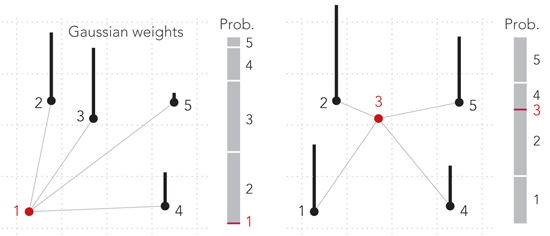
Now, we need a function to translate the original distances between the points into hopping probabilities. In t-SNE, this is done with Gaussian weights, i.e. one looks up the distance between two points on the standard Gaussian curve and attribute this weight to the pair of points. Note that this weight is not the hopping probability, though. Instead, hopping probabilities are defined as the rescaled weights, i.e. they are computed as the ratio of one weight to the sum of all weights for the point we hop from. The process is illustrated in the figure above. Points 2 and 3 are at equal distance from point 1, so the hopping probabilities from point 1 to either point 2 or point 3 are the same (left panel). Point 3 is more or less in the middle of the cloud, so the hopping probabilities from it are close to uniform (right panel).
This definition is asymmetric. For instance, the hopping probability from point 1 to point 3 is not the same as the hopping probability from point 3 to point 1. This is not a problem, and it is even the definition of neighborhood used in SNE (Stochastic Neighbor Embedding, the ancestor of t-SNE), but computations can be speeded up by using a symmetrized score. In practice, the matrix is symmetrized so as to store the probabilities of choosing a pair of points at random by first choosing a point uniformly, and then picking one of its neighbors by hopping. This joint probability distribution is the similarity relationship that t-SNE aims to preserve.
This criterion provides some flexibility on how to turn probabilities into distances in the reduced space. The major difference between t-SNE and SNE is that in the reduced space, hopping probabilities are converted to distances through t-distributed weights instead of Gaussian weights.
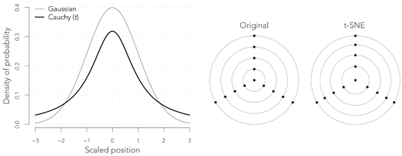
The Student t distribution with one degree of freedom, also known as the Cauchy distribution, is very much like the Gaussian, except that it has heavy tails, meaning that outliers have a much higher probability of occurrence, as shown in the graph above. In the present context, this means that while we visit the points at random in the reduce space, we are much more likely to hop to distant points.
This change has somewhat surprising consequences. The right panel above shows how a figure is transformed by this operation (here there is no reduction of dimensionality). The points that are close to the center are repelled towards the edges that are themselves compressed. The way to understand this is that our probability of hopping from any of the outward points to the central point must be the same as in the original figure, but since the weights are now given by the Cauchy curve, the central point must lie further away relative to the other points. This effect pulls the external points away from the center, and the periphery appears to be more compressed in comparison.
The implications of this property will be fully described in the next post. For now, we see that t-SNE projections can be thought of as the spatial representation of a random walk in the original data set. The points are laid in such a way that our probability to jump from one point to the next would be nearly the same in the original space. This explains why the t-SNE layout is only loosely linked to the layout of the point in the original space.
Conclusion
t-SNE is a dimension reduction technique that mixes theoretical and empirical principles. It aims to preserve the local neighborhoods between the points, and does this using different weights in the original and in the reduced space. This maintains the relative positions of the points, regardless of their actual distribution in the original space. This is very useful to identify clusters of data records with many variables, and the downside is that the axes of the reduced space do not have a straightforward interpretation.